
Ceramic Olive Oil Dispenser BottleAmazon A+ Case Study
Elevate your kitchen aesthetic and culinary workflow with our premium 10.1 fl oz matte black ceramic oil dispenser, designed for smooth, precise pouring and lasting scratch-resistant durability.

A+ Marketing Plan
Matte Black Elegance for Modern Kitchens
Start from a Small Set of Product Inputs
Capture source image, product facts, and style.

- Product title: Ceramic Olive Oil Dispenser Bottle
- Set details: 1 pc
- Dimensions: diameter: 1.97 in / 5 cm; height: 10.63 in / 27 cm
- Style judgment: Modern Editorial & Matte Minimalist
Discover Search Terms and Read Purchase Intent
BeePOP expands the keyword set, completes keyword research, and identifies what buyers care about in real search demand.
| Keyword | Type | Monthly Search Volume |
|---|---|---|
| ceramic olive oil dispenser bottle | core | 154235 |
| black olive oil dispenser | feature | 3339 |
| oil dispenser for kitchen ceramic | usage | 5836 |
Keyword Insight
High-volume search terms confirm a strong consumer demand for aesthetic kitchen organizers. Buyers actively seek 'ceramic' and 'black' dispensers to match modern kitchen decors, prioritizing both structural quality and drip-free functionality.
Design the Marketing Strategy from Buyer Demand
BeePOP turns search and product understanding into audience definition, selling points, differentiation, and a conversion path.
- Target users: Home chefs who value kitchen organization, Design-conscious homeowners seeking sleek decor, Culinary enthusiasts looking for precise oil control
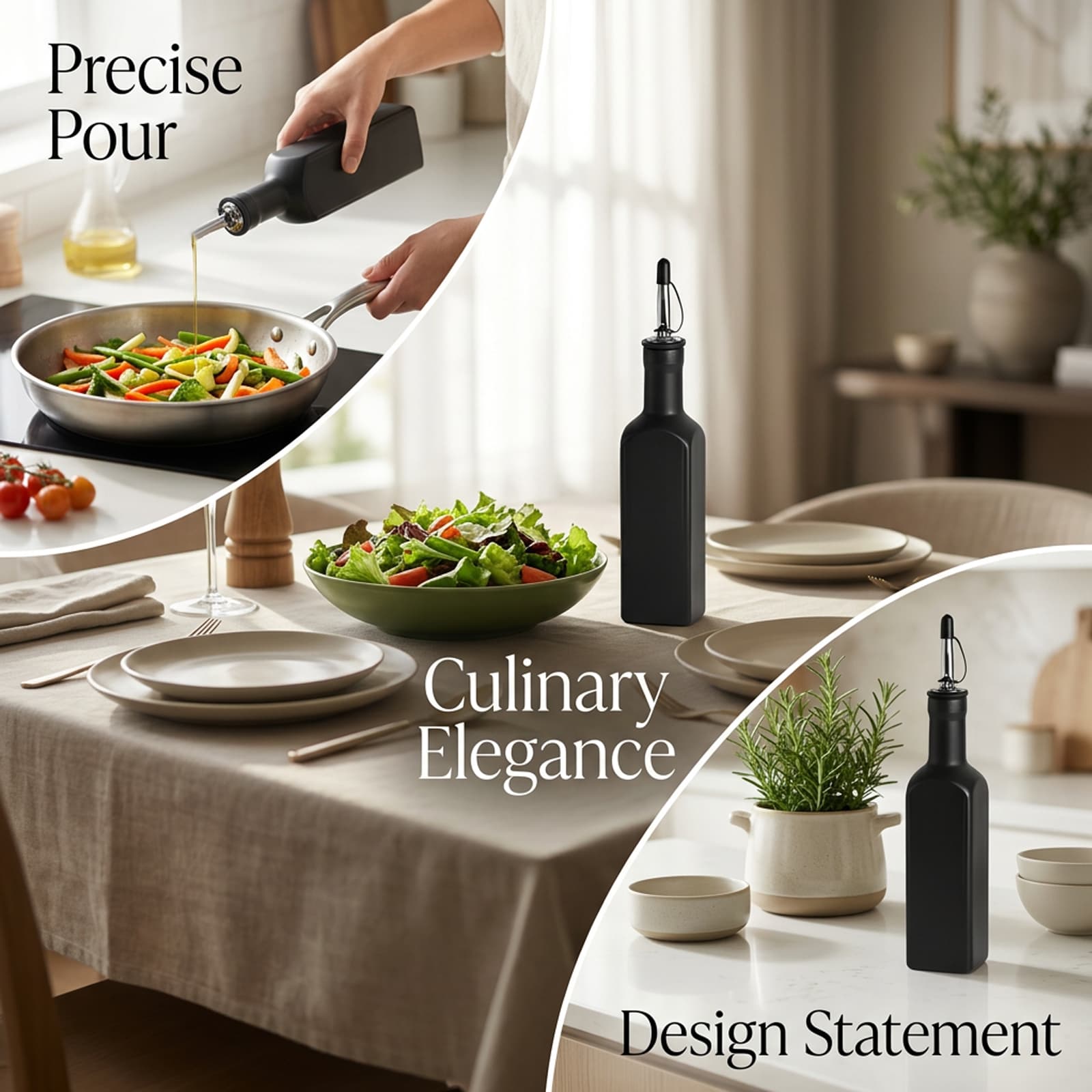
- Usage scenarios: Daily meal prep and gourmet cooking on a modern stovetop, Drizzling olive oil onto salads at a bright dining table, Elegant counter display alongside fresh culinary herbs
- Pain points: Messy drips from low-quality plastic or glass bottles, Aesthetically mismatched or cluttered-looking kitchen counters, Light exposure spoiling delicate oils in clear glass containers
- Core advantages: Opaque, scratch-resistant ceramic build protects oil from light degradation, Matte black finish provides a highly sophisticated modern look, Includes a convenient silicone funnel and labeling stickers
- Differentiation: Seamless blend of artisanal ceramic elegance with industrial precision spouts, Compact 10.1 fl oz size balances daily capacity with comfortable, single-handed pouring
- Buyer focus: Aesthetic appeal of the matte finish, No-mess pouring with the drip-free silicone funnel and spout, Material durability and longevity
- Main message: Redefine your culinary space with effortless pouring elegance.
- Delivery method: We build strong visual authority by contrasting clean, modern lifestyle setups against untidy, generic glass-bottle scenarios, emphasizing the matte ceramic's premium look and mess-free functionality.
- Priority: Visual style alignment first, followed by spill protection and durable ceramic material benefits.
Generate the Full A+ Plan
Based on the strategy layer, BeePOP defines how many images are needed, what each panel should communicate, and what conversion job each visual should perform.
Scene Fit Image
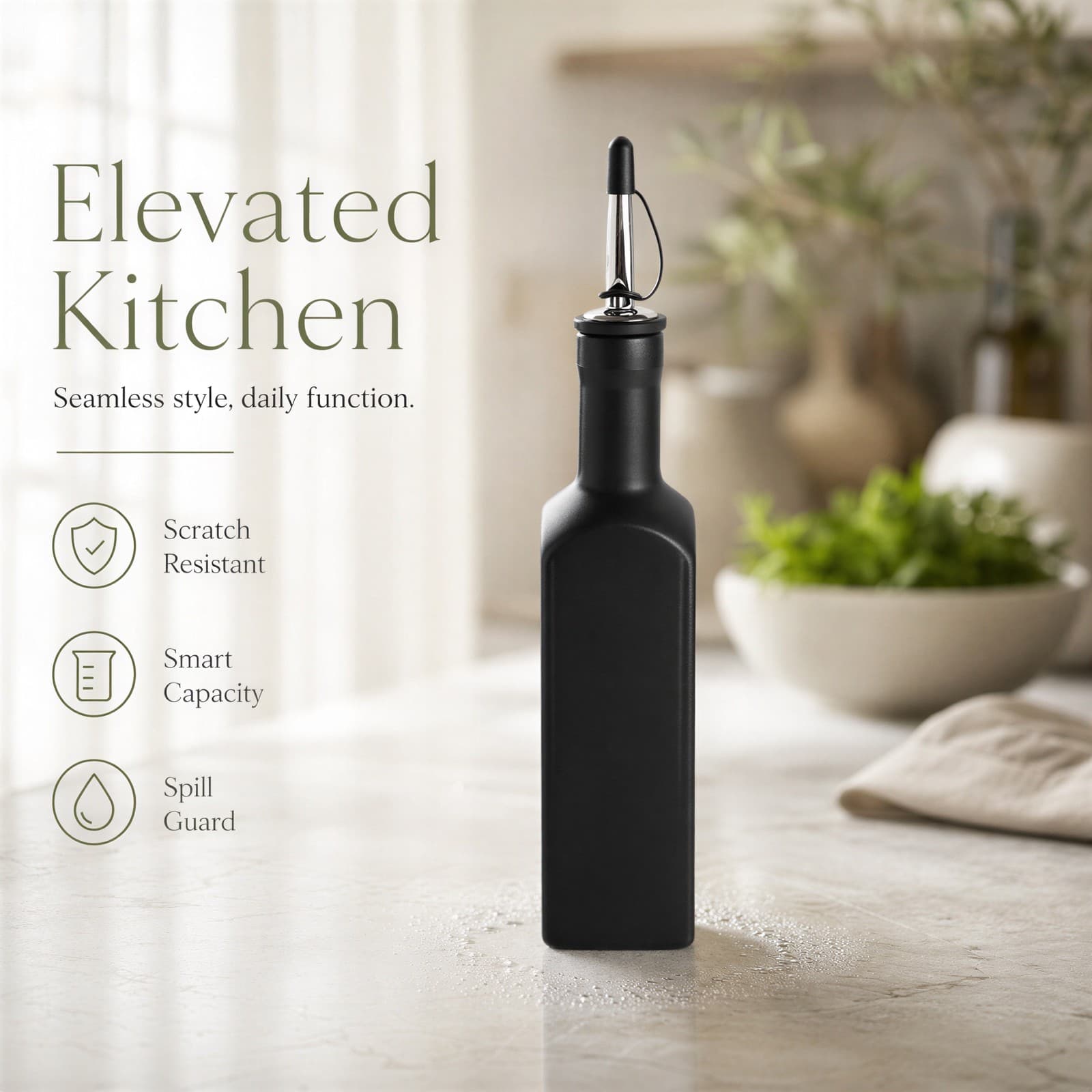
Premium matte black ceramic oil dispenser resting elegantly on a polished light kitchen counter, surrounded by a bright, warm morning glow.
Benefit Image
Multi-feature callout showcase highlighting the scratch-resistant matte finish, smart capacity, and spill-guard metallic spout with minimalist icons.
Scenario Image
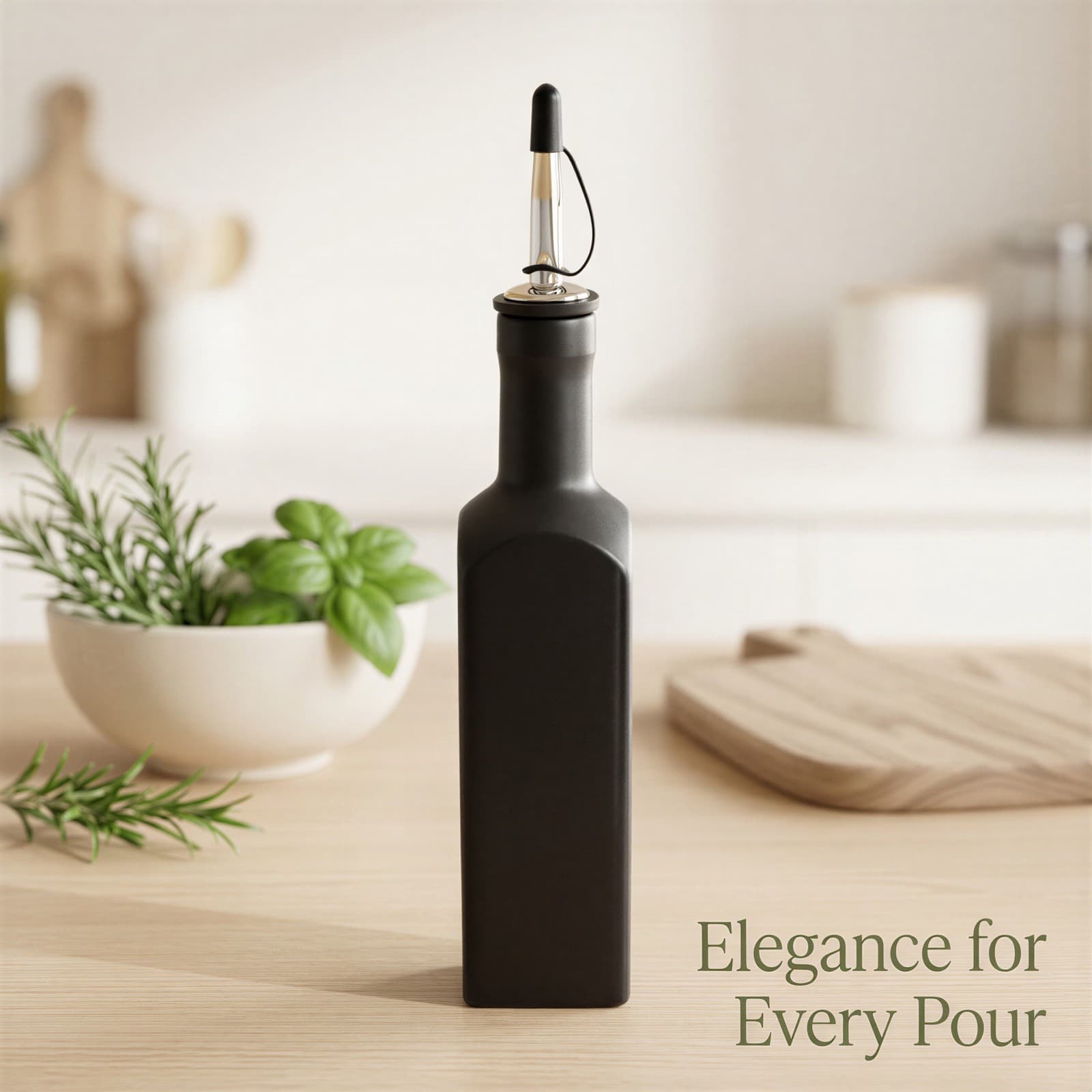
Elegant lifestyle scene with the dispenser integrated on a sun-drenched wooden countertop, accented by fresh culinary herbs in the soft background bokeh.
Comparison Image
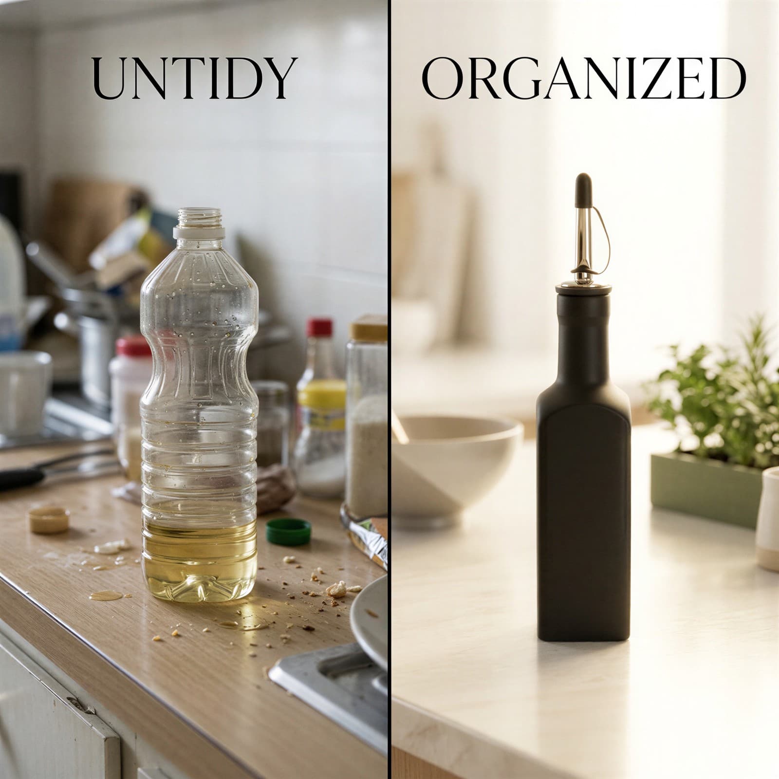
A split-screen comparison contrast. Left side shows a messy, generic oil bottle labeled 'UNTIDY'. Right side shows our sleek ceramic dispenser on a pristine counter labeled 'ORGANIZED'.
Hero Image
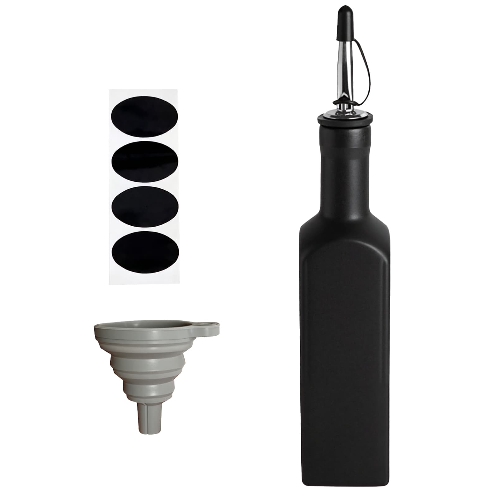
Crisp close-up hero shot of the matte black dispenser highlighting its elegant silhouette, textured grip, and shining chrome pouring spout.
Detail Image
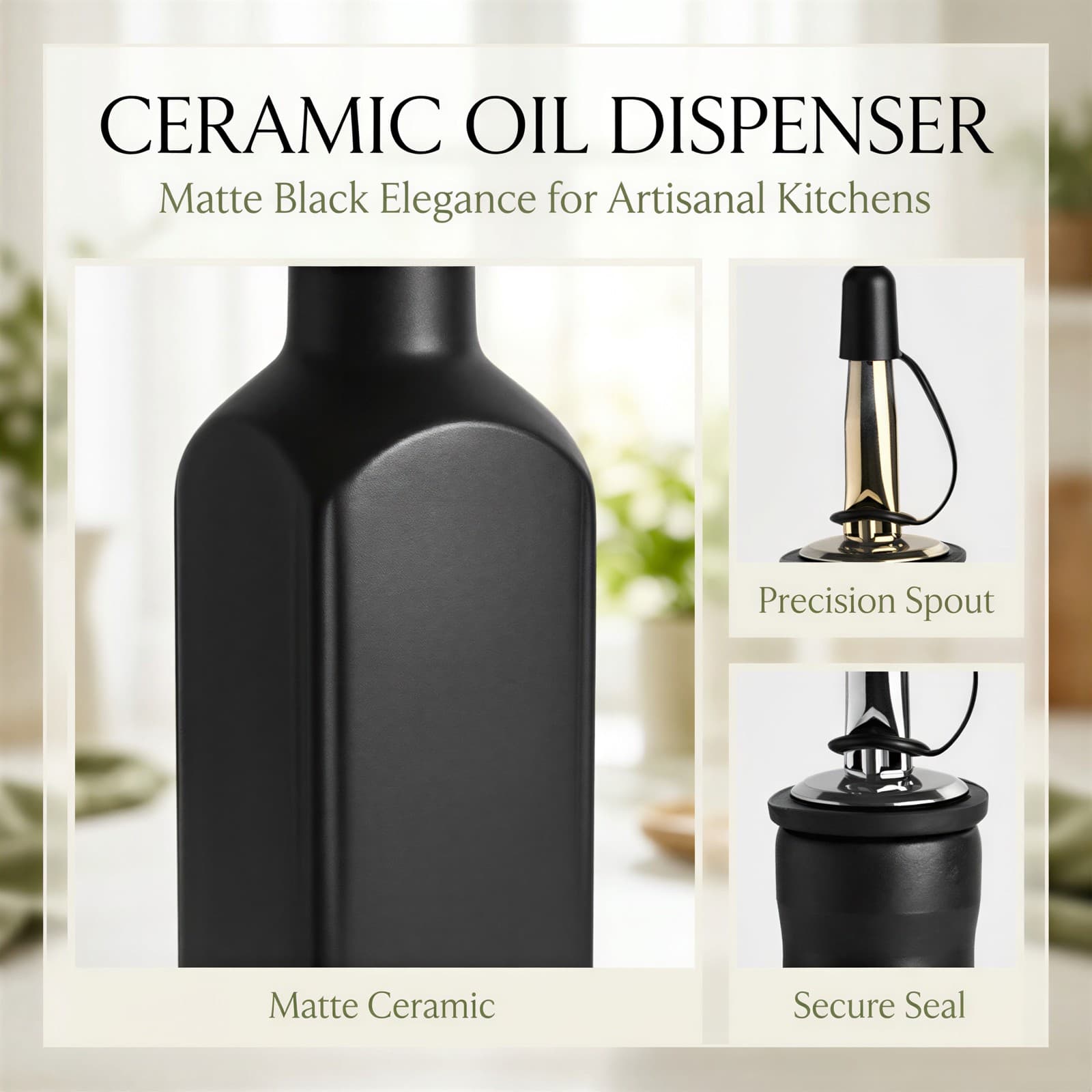
A detailed layout highlighting the three premium components: the matte ceramic body, the metallic precision pour spout, and the secure silicone seal.
A+ Visual Creation
BeePOP treats every image as an independent module to refine. Under the guidance of the A+ plan, it clarifies image purpose, breaks down execution points, and produces visuals that support the full page conversion goal.
Scene Fit Image
Establish a strong premium impression with high-end editorial kitchen imagery.
By placing the matte black ceramic bottle in a bright, sun-drenched modern kitchen setting, we instantly position it as an elegant lifestyle statement rather than just a basic kitchen tool.
- Use a high-key airy light scheme with soft-focus background bokeh to elevate product prestige.
- Display the matte black dispenser centrally on a light-colored countertop to achieve high contrast.
Benefit Image
Highlight key product features cleanly and directly to drive purchase intent.
This graphic layout balances high-end photography with informative typography to build immediate trust by mapping technical specifications to visual elements.
- Incorporate minimal serif headers to keep the visual tone sophisticated and editorial.
- Display three clean, labeled feature icons for Scratch Resistant, Smart Capacity, and Spill Guard.
Scenario Image
Contextualize the product within a peaceful, warm home-cooking environment.
Placing the dispenser next to natural wood tones and culinary greens triggers tactile and sensory cooking desires, encouraging the buyer to imagine it in their own kitchen.
- Utilize a warm alabaster and light wood palette for a cozy morning feel.
- Overlay 'Elegance for Every Pour' in a light, elegant serif font in the corner of the frame.
Comparison Image
Demonstrate the immediate organizational benefit over standard, messy glass bottles.
Showing a direct comparison targets the buyer's pain points of sticky oil counters, instantly framing our dispenser as the ultimate clean solution.
- Use a split screen with clear typographic labels: 'UNTIDY' (left, cluttered) and 'ORGANIZED' (right, clean).
- Keep the right half bright and airy to visually reward the customer for selecting the ceramic dispenser.
Hero Image
Showcase the detailed, premium craftsmanship of the matte black body.
Close-up lighting highlights the rich matte glaze texture and the secure fit of the gleaming metallic pour spout, validating the product's superior material quality.
- Apply a dual-sided rim lighting setup to trace and emphasize the bottle's 3D silhouette.
- Ensure a subtle gold micro-accent glints off the chrome pouring tip to suggest luxury.
Detail Image
Break down the core components to assure customers of quality construction.
A detailed layout breaks down the product into its core value areas—the body, the spout, and the seal—assuring the buyer of practical durability.
- Organize three distinct panels showing close-up macro crops of the body texture, metal pourer, and seal ring.
- Ensure clean alignment and neat text labels beneath each panel to mimic a premium product catalog.
FAQ
More Use Cases
Home & Kitchen
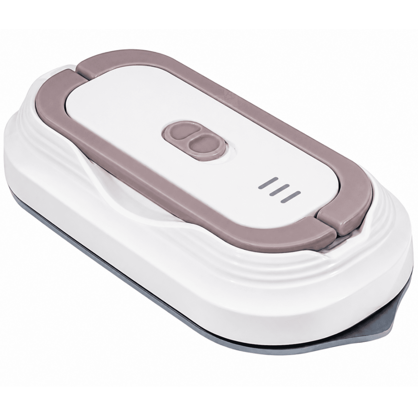
Mini Travel Steam Iron
An ultra-portable 60W dual-voltage mini steam iron with a 10-second fast heat-up and detachable design. Engineered for international travelers, busy professionals, and student dorms to deliver quick, professional garment smoothing anywhere in the world.
Jul 7, 2026

Home & Kitchen
Gothic Witch Table Lamp
Elevate your Halloween celebrations and year-round gothic home style with this beautifully crafted witch lamp. Emitting a soft, warm amber glow, it serves as the perfect mystical accent for bookshelves, mantelpieces, and bedside tables.
Jul 3, 2026